Mobile App UI/UX Design Services Sydney
Create stunning, user-friendly mobile app designs that convert. Our Sydney-based UI/UX designers craft intuitive interfaces following Apple and Google design guidelines.
The difference between a successful app and one that gets uninstalled within minutes often comes down to design. Studies show that 94% of first impressions are design-related, and users form opinions about an app within 50 milliseconds. In today's competitive app market, exceptional UI/UX design isn't a luxury—it's a necessity.
At Awesome Apps, our Sydney-based design team creates mobile experiences that users love. We combine aesthetic excellence with deep understanding of user psychology to design apps that look beautiful and function intuitively.
Understanding UI vs UX Design
While often mentioned together, UI and UX represent distinct but complementary disciplines:
User Experience (UX) Design
UX design focuses on the overall feel of the experience. It answers questions like: How easily can users accomplish their goals? Does the app flow logically? Are interactions intuitive? UX designers research user needs, create information architecture, design user flows, and prototype interactions before visual design begins.
User Interface (UI) Design
UI design focuses on the visual and interactive elements users actually see and touch. This includes typography, colour schemes, button styles, icons, animations, and spacing. Good UI design makes the UX tangible, creating visual hierarchy that guides users naturally through the experience.
Our Design Process
1. Discovery and Research
Great design starts with understanding. We begin by learning about your business, target users, and competitive landscape. This includes:
- Stakeholder interviews to understand business objectives
- User research through surveys, interviews, or analytics review
- Competitive analysis of similar apps
- Creation of user personas representing your target audience
2. Information Architecture
We map how content and features are organised within your app. This invisible structure determines how easily users can find what they need. We create:
- Site maps showing all screens and their relationships
- User flows documenting paths through key tasks
- Content hierarchy prioritising information by importance
3. Wireframing
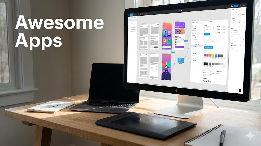
Before adding visual polish, we create low-fidelity wireframes—basic layouts showing element placement without design details. Wireframes let us iterate quickly on structure and functionality without getting distracted by aesthetics. We typically create wireframes in Figma, allowing for easy collaboration and feedback.
4. Visual Design
With structure validated, we apply visual design. This phase transforms wireframes into polished interfaces that reflect your brand while following platform guidelines. Key elements include:
- Colour palette selection aligned with brand and accessibility
- Typography system ensuring readability across devices
- Iconography that communicates clearly
- Component library for consistent design patterns
- Micro-interactions that add delight and feedback
5. Prototyping
Interactive prototypes let you experience the app before development begins. We create clickable prototypes in Figma that simulate real app behaviour, including animations and transitions. This investment catches usability issues early when changes are inexpensive.
6. Design System Documentation
We deliver comprehensive design documentation that ensures consistent implementation. This includes:
- Component specifications with spacing, colours, and states
- Animation guidelines for developers
- Accessibility annotations
- Asset exports in required formats and resolutions
Platform-Specific Design Excellence
Whether you're building for iOS, Android, or cross-platform apps, great UI/UX design must respect each platform's unique conventions and user expectations.
iOS Design (Human Interface Guidelines)
Apple users expect apps that feel native to their devices. Our iOS app development team designs following Apple's Human Interface Guidelines, incorporating:
- SF Pro typography system
- Native navigation patterns (tab bars, navigation stacks)
- iOS-specific gestures and interactions
- Support for Dynamic Type and Dark Mode
- Safe area considerations for notches and home indicators
Android Design (Material Design)
Android users expect Material Design patterns. Our Android app development services incorporate:
- Material 3 (Material You) theming
- Android-specific navigation (bottom nav, drawer)
- Appropriate use of elevation and shadows
- Edge-to-edge design with system bar handling
- Support for various screen densities and sizes
Design for Conversion
Beautiful design must also drive business results. Whether you're creating healthcare apps, fitness solutions, or retail experiences, we apply conversion-focused principles:
- Clear CTAs: Primary actions are visually prominent and strategically placed
- Progressive Disclosure: Showing information when needed, not overwhelming upfront
- Social Proof: Incorporating reviews, testimonials, or user counts naturally
- Friction Reduction: Minimising steps between intent and action
- Trust Signals: Security badges, guarantees, and professional aesthetics
Accessibility-First Design
Accessible design isn't just ethical—it's good business. We ensure apps work for all users by:
- Meeting WCAG 2.1 AA colour contrast requirements
- Supporting screen readers with proper labelling
- Designing for various motor abilities (tap targets, gesture alternatives)
- Ensuring functionality without colour dependence
- Testing with accessibility tools on both platforms
Design Deliverables
Our design engagement delivers:
- Figma Files: Organised, developer-ready design files
- Interactive Prototypes: Clickable prototypes for testing and stakeholder review
- Design System: Documented components for consistent development
- Asset Exports: Icons, images, and graphics in all required formats
- Design Specifications: Detailed measurements and documentation
Design Investment
UI/UX design typically represents 15-25% of total app development cost:
- Basic App Design: $2,000 - $5,000
- Standard App Design: $5,000 - $10,000
- Complex/Custom Design: $10,000 - $20,000+
This investment prevents costly development rework and dramatically improves app success rates. Apps with thoughtful design see higher engagement, better retention, and stronger word-of-mouth.
Why Choose Awesome Apps for Design
Our Sydney design team brings:
- Platform Expertise: Deep knowledge of iOS and Android conventions
- Development Understanding: Designs that developers can efficiently implement
- Business Alignment: Design decisions driven by your business goals
- Iterative Process: Regular feedback loops ensure alignment
- Local Collaboration: Face-to-face workshops and presentations
Start Your Design Project
Whether you're starting from scratch or redesigning an existing app, great design is the foundation of mobile success. Our team helps Sydney businesses create apps that users love and that drive measurable results.
Contact us for a free design consultation. We'll discuss your vision and show you how thoughtful design can transform your mobile presence.
Talk to a Sydney app developer — free.
30 minutes. We'll tell you what your app needs, how long it takes, and what it costs. Real answers, no sales pitch.
Book Free App Strategy Call →Free · 30 minutes · No obligation
Free Mobile App Cost Guide 2026
The honest guide to app pricing in Australia — ranges, what drives cost up, and how to get the best value.